‘Not My Type’: Columbia students’ typeface projects now on display at the Glass Curtain Gallery
July 14, 2021
“Not My Type, Typefaces on Display” takes a deeper look into the ways typeface communicates certain ideas and messages, bringing a platform to societal injustices by taking inspiration from typographers.
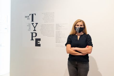
The exhibition, curated by Sarah Faust, an associate professor of instruction in the Design Department, with assistance from senior graphic design student Bri Elliott and the support of the Design Department, features 15 students’ projects working with typefaces and is now on display at the Glass Curtain Gallery.
Works from Elliott, as well as students Kalia Allen, Elsa Mae Brydalski, Gwenyth Bechtel, Michelle Lee, Jon Lovisetto, Omar Ojeda, Jasmine Olayan, Dakota Portell, Genesis Rios, Marco Rodriguez, Rosie Ruiz, Rachel Tanner, Joseph Trezek and Roger Vazquez, are now being featured in “Not My Type,” an exhibition exploring how time periods and certain messages are conveyed through different fonts.
The free exhibition at the Glass Curtain Gallery, 1104 S. Wabash Ave., allows 10 visitors inside at a time, and face masks are required.
Pulling projects from her “Typography for Graphic Design” classes, Faust allowed students to explore different typefaces that interested them and encouraged a focus on subjects with a narrative background for the gallery.
Students met with Faust on Zoom every Saturday toward the end of the spring semester for designing and planning sessions, started printing and fabricating in mid-May and began installing the show during the first week in June.
Among the 15 students, Brydalski, a 2021 graphic design graduate, focused her piece, “La Didot,” on the typeface “Didot” after sharing that she has an affinity for the French aesthetic of the font. Used for the title of Vogue magazine, the name came from the Didot family in France and was designed in the late 1700s.
With her piece projected in the gallery, Brydalski said viewers could walk into the room and feel the different moods while the video projects on the wall.
“If you want to stand right on the wall where the projector is going, you can have the video play over your face,” Brydalski said.
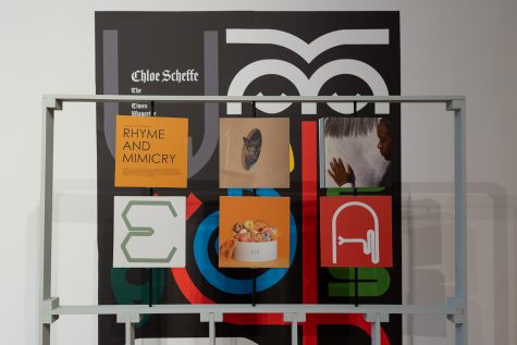
Lee, a 2021 graphic design graduate, said her exhibit “Rhyme and Mimicry” features editorial designer, writer and editor Chloe Scheffe, letting viewers feel as if they are walking to an altar.
“The exhibition showcases The New York Times Magazine 2017 Health Issue. The special issue focuses on animal research and its impacts to the development on human medicine,” Lee said. “Chloe Scheffe’s illustrations are a rhyme and mimicry on the phenomenon of seeing faces in objects, like seeing the face of Jesus on a potato chip.”
Junior graphic design major Vazquez focused his piece, “Mexico 68,” on the typography and brand design for the Mexico 1968 Olympics, using works made by Lance Wyman, an American graphic designer known for his work in developing the logo.
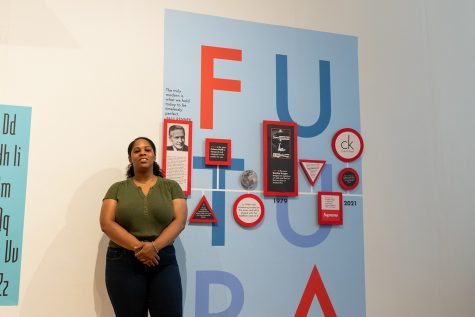
Allen, a junior graphic design major, has her project “Futura: Timelessly Perfect” being a timeline of the use of “Futura,” designed by German typeface designer Paul Renner in 1927. Having been passionate about graphic design since high school, she said putting different elements together to make something has always been what she loves doing.
Allen said working on this installation opened her eyes to the histories and importance of certain typefaces, with Futura’s use by big names such as Nike and Supreme being her inspiration to make a timeline.
Elliott took inspiration for her exhibit “Redaction” from various social issues tied with legal documents throughout history, pulling from artists such as Forest Young, a Yale graduate and graphic designer, and Jeremy McCall, a typeface designer.
Elliott added that a lot of her inspiration came from type designers of color and that the popular typeface “Times New Roman” was the main focus.
Graphic design senior Rios’ project “Keep It Casual” focuses on how single-stroke hand lettered signage grew in popularity.
“My exhibition is focused on who and how single-stroke hand lettered signage came to be, in particular the style that has been developed and is seen throughout local Chicagoland grocery stores, with the bright colors and gothic-style sans serifs,” Rios said. “The focal point of my installation are letterforms and strokes, which highlight casual and slant casual hand brushed lettering.”
Gallery visitors also can get free giveaways from the exhibits, each one having something unique to the projects.
This month, the artists will hold virtual gallery tours with narration and clips of students talking about their designs and the process, as well as interviews with the typeface designers showcased on the Department of Exhibitions, Performance and Student Spaces website homepage and YouTube channel.
“Not My Type, Typefaces on Display” will be on exhibit at the Glass Curtain Gallery through Aug. 6, Mondays through Fridays from 9 a.m to 5 p.m.