College’s branding campaign debuts to mixed reviews
The college is scheduled to launch its new look and message on Sept. 19, which was designed by Ologie, a consulting company based in Columbus, Ohio.
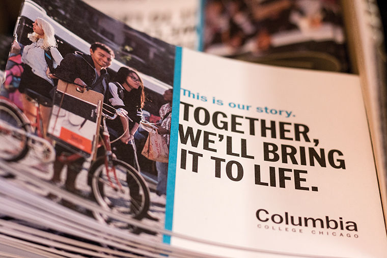
September 19, 2016
After a year of working on a rebranding and advertising campaign to increase enrollment and local and national brand awareness, the college is ready to roll out its final product.
The rebranding campaign, scheduled to fully launch Sept. 19, includes the college’s name in boldface with more spacing between the letters and elimination of the 2010 “Live What You Love” tagline. The new “word mark” is part of the college’s efforts to increase enrollment and understanding of Columbia’s brand, said Deborah Maue, vice president of Strategic Marketing and Communications.
A palette of six colors named after campus and city landmarks, more than five new messages referred to as “healthy tensions,” radio advertisements on Spotify and Pandora, a video advertisement on Hulu, and print advertisements in the Tribune are also part of the college’s new campaign, Maue added.
The new marketing campaign—partially launched internally over the summer—was designed by Ologie, a consulting company based in Columbus, Ohio, and is primarily targeting prospective students and their parents. The company created the campaign after the college realized the average person did not have a clear understanding of the college’s brand, Maue said.
“You could talk to 10 different people, and you’d get 10 different answers about what our brand is and what we stand for,” Maue said. “There was a need to create a shared story around who we are and who we want to be.”
President and CEO Kwang-Wu Kim said he used to hear comments about the college’s open acceptance when he first arrived at the college—instead of celebrations of the college’s history and faculty, staff and alumni.
“My personal ambition was to make sure we lift the college up, [and] we really focus on the quality, excitement and energy of the institution,” Kim said. “You have to really want to be in this environment to be a student at Columbia.”
Maue said the college’s “Live What You Love” tagline will not be part of the rebranding campaign, adding it is difficult to define Columbia in a short phrase.
“It’s very difficult to capture the richness and the complexity of a place like Columbia in four words,” Maue said.
For Kim, the tagline was incomplete and lacked purpose.
“We have much more responsibility [than that],” Kim said. “We have to encourage people to build their lives on things they love but give them the tools to succeed. If it was a slogan, it was only half of a slogan.”
Steve Gaither, president and founder of JB Chicago, a local marketing agency, said it is not necessary to have a tagline, and it depends on the consulting company’s process and client.
“If [providing a solution to your costumer’s needs] can be done in four words, awesome,” Gaither said. “If it takes more than four words and a combination between brand strategy, brand name, tagline and messaging, so be it.”
Nathan Thornton, Ologie’s executive creative director, said the company discontinued the tagline because they can eventually become outdated.
Bob Killian, chief branding strategist of Killian Branding, said he does not agree, adding that taglines do not always have to be an explanation of the brand, but a way of broadening and reinforcing its message.
“The idea that you can’t explain the brand in four words is silly,” Killian said.
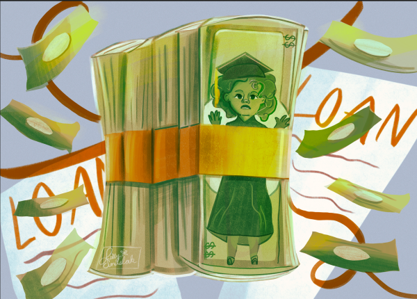
The campaign was also designed to increase enrollment and find alternative ways to fundraise, Maue said.
According to a Sept. 14 email from college spokeswoman Cara Birch, the budget for the project was divided between the brand strategy and the advertising campaign. The email stated the costs for brand strategy, brand guidelines, templates, internal booklets and the prospective student viewbook were $259,500.
For the advertising campaign, the college spent $427,000, which included media purchases and productions costs, for a total of $686,500 spent on the rebranding campaign, according to the email.
Maue said it was difficult to calculate the total cost of the brand strategy because the college sent Ologie some printing materials for prospective students, which were initially done internally by the college.
Killian declined to comment whether the amount Columbia spent was appropriate for the project’s final results.
According to Jessica Boggs, senior director of Columbia’s design group, the now-bolded typographic treatment retains its previous elegance. She added that the six primary colors—which include black, white, “Red Line” red, “Grant Park” green, “Wabash” blue and “Portfolio” purple—along with secondary colors were chosen to create a sweeping color palette.
“We picked six colors because we wanted to make sure we didn’t fall into the trap of people thinking we had school colors,” Boggs said. “We also wanted to make sure we created visual consistency by setting brand guidelines.”
Killian said he does not think the new logo reflects Columbia’s creative personality and described the type as “conventional” and “boring,” saying the word mark will have no impact at all because it is not different from the previous one.
“In this case, it’s a mistake to not express the kind of institution that [Columbia] really is,” Killian said. “It looks like a [campaign for a] bank and not appropriate at all.”
He added that the new color palette is not very different from what the college previously had and believes there are too many colors.
“You might as well have no limits at all,” Killian said. “It’s not very disciplined. We would never recommend having that many [color] possibilities.”
The campaign is distinguished by the concept of “healthy tensions,” which includes messages such as “finding the beauty in the grit” and “when the teacher learns from the student,” or ideas that occur naturally at the college, Maue said.
Killian said he liked the “healthy tensions,” specifically the word “grit,” which conveys the urban environment of Chicago.
“I hope when students start to see the materials being developed using these new branding ideas, they [will] be excited and proud of the college,” Kim said. “I want students to see why these materials reflect the kind of school [they] are going to [and] feel excited about. I think that will happen [with this campaign].”