Pimp my diploma: Columbia gives a new look to its sheepskin
May 5, 2014

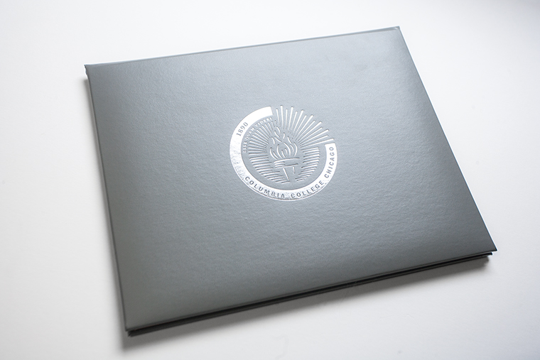
The college’s new diploma, designed by Hannah Rebernick, a Columbia graphic design alumna, incorporates the college’s new seal.
Columbia graduates are about to look more legit.
To address graduates’ com- plaints that employers question the legitimacy of their 9-by-9 inch square diplomas, which were implemented in January 2004, the college has updated its diplomas to a standard 8.5-by-11-inch design.
“The problem with the old diplo- ma was that it didn’t look like a di- ploma,” said President Kwang-Wu Kim. “When international students would take their diplomas home, no one would actually believe that they had gone to a real school.”
Kim said his main objective was to make the diplomas simple, read- able and elegant so students would be excited to receive them.
Changing the diploma size saved the college approximately $18,000 because the previous diplomas required custom cases and frames that cost the college a substantial amount of money, according to Susan Sindlinger, director of Transfer Evaluation at Columbia.
The dimensions are not the only aspect of the diplomas that changed, said Hannah Rebernick, a 2013 art + design alumna and a junior designer for Columbia’s Office of Creative Services Rebernick led the design process and said she wanted to create a more formal looking diploma that would represent Columbia’s color scheme and identity.
The diploma will still include previously used visual elements such as foil stamps and blind em- bossing but will feature a simpler font, Rebernick said. According to Mary Forde, assistant vice presi- dent of Creative Services, Rebernick added artistic elements to the diploma while preserving the diploma’s traditional appeal.
The updated design will feature the new presidential seal, which has been updated from the college’s first official seal created in 1993, according to Sindlinger.
Heidi Marshall, head of College Archives, helped the research for the new seal, by presenting creative services with information on the meaning of symbols.
Columbia’s first official seal fea- tured an open book with a globe, the letter “C,” 1890—the college’s founding year—and the motto “Esse quam videri,” which means, “To be, rather than to seem.” The new seal features a torch emitting a light that breaks the seal’s border, creating an impression while creating the illusion of a city skyline, Kim said. Kim said he thought the previous seal, looked “amateurish” and did not reflect the college’s focus on the future.
“I thought [rays of light were] a really powerful idea: the creative spirit of the institution breaking through and connecting to the larger world, which is so important to me,” Kim said.
Rebernick said designing diplomas for a college without school colors is an interesting challenge because Columbia has a reputation for being an informal institution.
She said the college prides itself on beautiful imagery that showcases students at work and people practicing their craft, which is what inspired her design. Rebernick said she was honored to design the school’s new diploma and to be a part of the college’s history.
“It was really exciting to work on [the diploma] as a … recent alumna and to be new to creative services and to see the kind of work they really put into projects like this, and … the work I was capable of doing because of Creative Services,” Rebernick said.


