Renegades remain: Columbia sports keep name, change logo

May 26, 2019
When the Renegades first announced its rebranding campaign, not everyone knew what its logo was.
Paulina Ryt, a junior graphic design major, said the previous logo was hard to read. The logo featured a person wearing a bandana, even though the teams were called the Renegades.
The Renegades began rebranding in October 2018, as reported by The Chronicle. As part of the rebrand, it accepted student submissions for a new logo and name.
The Fierce Frogs, Marveling Moose and Renegades were the three proposed logos for students to vote on. The Renegades, with a phoenix as its logo, gathered 655 votes, more votes than the moose and frog combined.
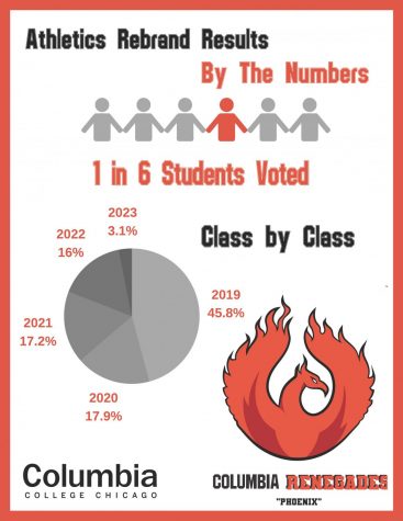
The new logo features a bright red Phoenix with flames protruding from its wings.
Jacob Schmidt, president of the Student Athletic Association and senior music technology major, said 1,108 votes were cast in the logo vote. The poll had the most votes in any ballot in the history of Columbia, Schmidt said.
Schmidt did not expect the amount of votes the poll received.
“At Columbia, as with any school, there’s commuters, so it is difficult to get that student involvement,” he said. “Also being an arts school … makes it even harder.”
Schmidt hopes this campaign will give Columbia students an identify on campus.
“We did need a … fresh, newer look to the Renegades,” said Ryt, who designed the moose and helped with the phoenix logo. “Bringing in the phoenix will definitely bring a more clear image, and a more identifiable mark.”
Schmidt helped design the phoenix and drew inspiration for the design after researching the history of Columbia. He said the phoenix represents the identity of Columbia students.
“It does match the … passion they have for these sports,” said Julia Zeler, junior illustration major. “A phoenix is traditionally fiery, hot and full of passion.”
Katie Kehoe, 2019 illustration aluma and former Renegade volleyball player, voted for the phoenix.
“I did not want us to be the frogs,” she said. “The phoenix feels more like a sports team. I haven’t ever really heard of a frog or a moose [themed] team.”
While at Columbia, Kehoe said she had not met a student who knew there were sports teams at Columbia, unless they were already on a team.
But the rebrand helped the Renegades become more visible on campus, Ryt said.
Ryt remembers hearing students talk about the three proposed logos around campus. Even teachers in her graphic design classes would ask students which logo they would vote for.
“The whole intention of the rebrand … was [to get] recognition from the school itself,” Schmidt said.
For the Renegades to get support from the administration, Schmidt said, SAA had to show the college the student body would back the Renegades. For that reason, student submissions were opened.
Schmidt said the Renegades have come a long way.
“Looking forward it’s exciting,” he said. “We have a lot of eyes on us now.”