New website to change the future of enrollment
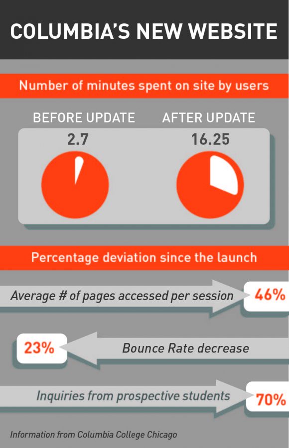
The preliminary report shows increased use of the site overall. The length of time users spend on the site has increased from 2.7 minutes to 16.25 minutes. The bounce rate, a measure of how often a user decides to leave a site after only visiting one page, has improved by 23 percent and the average number of pages visited per session have also improved by 46 percent, according to an Oct. 31 statement from the college.
November 17, 2014
Analytic reports of Columbia’s new website show an increase in the length of sessions by visitors, the number of pages viewed and inquiries from prospective students since its Sept. 10 launch.
The preliminary report shows increased use of the site overall. The length of time users spend on the site has increased from 2.7 minutes to 16.25 minutes. The bounce rate, a measure of how often a user decides to leave a site after only visiting one page, has improved by 23 percent and the average number of pages visited per session has also improved by 46 percent, according to an Oct. 31 statement from the college.
The statement acknowledged that some of the improvement is a result of faculty, staff and students examining the new site. However, isolating off-campus users still shows an improvement in many aspects of the website use.
Anne-Marie St. Germaine, interim vice president of Communications & Marketing, said the new initiative began in March 2013 after the college partnered with iFactory, a website design firm based in Boston, Massachusetts. iFactory did extensive research for the college, but most of the work was done by an internal team of web developers. The website went live at the beginning of the fall semester after months of work. St. Germaine said the intent behind the new website was to be student-centered and to particularly appeal to prospective students and encourage them to pursue their degree at the college.
“[The goal was] to tell a story that aligns with what their experience would be if they came to the school, to engage with them and get them interested in the college,” St. Germaine said.
St. Germaine said the administration hoped the college would see a jump in inquiries from prospective students by creating a more accessible and eye-catching site that would get them interested in the college. The end goal is to have the newly designed website be an asset for the college, an effective tool for enrollment and a way to increase traffic. However, these changes need to be monitored over time.
“Our goal is to engage prospective students through this new website so they take the next step to learn more about Columbia, visit the campus and ultimately enroll and complete their four-year degree,” St. Germaine said. “It is shown that any college or university’s website is very important because it’s usually the first stop for information.”
Michael Settepani, a junior journalism major, said he thinks the new website is easy to navigate. He said the website is very organized because of the subcategory arrangement. He is able to find what he needs quickly. The site also has a very appealing aesthetic that matches the environment of the college as well as the artwork outside of the campus buildings and various building branding, he said.
“The artwork and pictures are very Columbia,” Settepani said. “It reminds me of how Columbia really likes to focus on the art itself.”
Settepani also said having an “Apply now” button encourages prospective students to apply straight from the site.
According to the statement from the college, the Office of Undergraduate Admissions has experienced a 70-percent increase in inquiries from prospective students since the launch of the new website.
Rylie Daniels, a native of Flint, Michigan, was recently accepted to the college and plans to study in the Business & Entrepreneurship Department with a live and performing arts concentration beginning in Fall 2015. She wanted to move to Chicago for school, so after looking at several Chicago colleges, Daniels said she decided on Columbia because of the Business & Entrepreneurship Department, which she learned about after searching for the degree and arts management classes on the new website. She said she spent time on the website looking through different majors and minors as well as researching housing and campus tour opportunities.
“It was easy for me to look at everything,” Daniels said. “I can’t really compare it to the old one, but it was pretty easy for me to navigate, and I could see what I needed to.”


